|
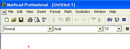
Step 1: Launch Mathcad. Starting Mathcad
interface looks like the images below.
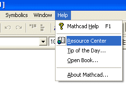
Click on Help and select Resource Center.
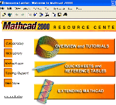
Resource Center window will open. Click on OVERVIEW and TUTORIALS
Step 2: In the new page, MATHCAD
OVERVIEW AND TUTORIALS ,
there are several topics that you can choose from. Click on
Getting Started Tutorial . In the new page you
will see several links to individual tutorials. I recommend that you go through them in order
to make yourself familiar with the software and its interface before continuing to the next step.
Step 3: Click on the link to
Creating Graphs and check to see how easy it is to
create graphs in Mathcad. You can plot both 2-D and 3-D graphics which by
default would appear as inline graphics at a location that you identify on the worksheet.
As you notice there are several ways to create graphs and I encourage you to explore different ways
of doing it. In this step, I am going to show you couple of ways of doing
it. Let's
start with a 2-D function of f(x) = 4 x3 - 3 x2
- 8 x + 5. First enter the function f(x):4x^3
-3x^2 -8x+5 Which will be shown as f(x):= 4x3
-3x2 -8x+5 on the screen. Press enter and then
define a set of values for x by typing x: -3;3 which will be shown as
x:=-3..3, which is indicating that values of x would range between -3 to
+3. These are the starting values and we
can adjust them after we see the actual plot (Of course you may choose to substitute
x = - 3 and x = + 3 in the function and find the actual f(x) values
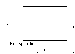
associated with the range, if you choose to do so). Now simply click anywhere on the worksheet
(leave enough space for the graph) and type @. You should get a blank
plot area with two axes and placeholders (small solid squares) each next to x
and y axes. Click on the placeholder below the x axis and type
x.
You will immediately notice that two new placeholders appear below the x
axis.

For now ignore them. Press the TAB key to move to the placeholder
on the vertical axis (or directly click on it).
Type f(x) in that location and then press ENTER or click anywhere outside
the plot box and you have your function plotted.

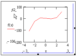
The plot uses default values. If you want to change the range values for
x and y axes, just click one more time inside the plot area and
you will see the handles for x and y values. You can click
on them and set your own values for those. Notice that as you change a
quantity, the associated value on the proper axis would be updated to the new
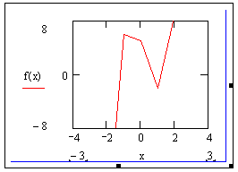
ones. The following figures shows change of upper and lower values for the y
axis.
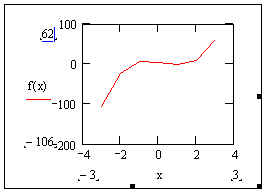
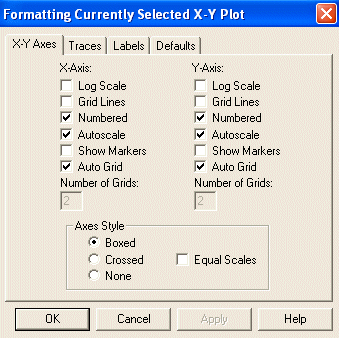
Now right-click anywhere inside the plot area (or double-click) and from the
widow that opens choose Format.
The Format window opens with a number of options available to you.
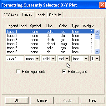
Select the Traces tab. You can change the representation of the curve in
this section. Notice that trace1 which refers to the f(x)
curve shows the color red under the color section which is the current
color of the curve in our graph.
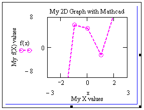
If you select the Labels tab you can provide title for your graph and
label your axes.
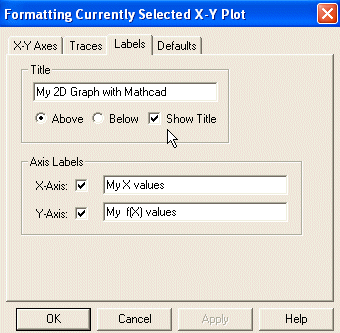
The image below shows the same graph with some changes applied to it through the
Format window.
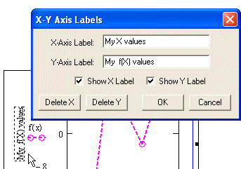
You can also double-click on a lable which will opens a small widow allowing you to change the
label values. This is true for bothe x and y labels as well as for the plot tiltle.
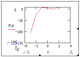
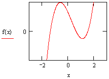
Notice that the plot is not smooth and looks rough. That is because, the f(x) values
were calculated only for x values of -3, -2, -1, 0, 1, 2, and 3 and then those points
were connected with straight lines. To smooth the plot we need to increase the numbers of
the points at which the function will be evaluated. The only thing that we need to change is in
the x:=-3..3 statement. Change it to x:=-3,.25..3 and see the results.
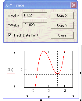
Now, let's explore an additional useful item. Right-click on the graph and
from the window select Trace. A small widow will open with locations for x
and y values. Now click anywhere on the curve and the values of x and f(x)
will be displayed on that window. Even if you are not exactly on the curve the trace is made to a
point on the curve (based on the y value where you clicked). This can actually show you
the values of the min and max for the function in the displayed range.
You can also plot several graphs together. Here is an example:
f(x) = 4 x3 - 3 x2 - 8 x + 5
g(x) = 12 x2 - 6 x - 8
x:=-3,0.1..3
Now at some blank space type: g(x),f(x)@ and then go through the
fixing the values of different placeholder. Alternatively, you could have just typed the
@ symbol just as you did earlier and when placing the
f(x) on the y axis placeholder add ,g(x) to it.
Simple and effective.

Click Here to continue to
the next tutorial.
|