

Some of the useful tags that we studied in the previous units are:
HTML HEAD TITLE BODY CENTER B, I, and U H1, H2, ..., H6 P and BR OL, UL, and DL
(LI, DD, DT)SUB and SUP IMG FONT BLOCKQUOTE HR PRE A BGSOUND EMBED META MAP TABLE
(TR, TD)FRAME APPLET
In this tutorial, we will introduce Javascripts which have become one of the most important tools for Web designers of today.
CSS are text files, or special text in a HTML file, which allows you to specify styles, formatting, and positioning of HTML objects. Style is what gives an item its distinctive look or feel. For text it could be what font is used, what color, size, or spacing. It also applies to other HTML objects such as links, images, backgrounds, margins and borders.Some of the benefits to using CSS are more consistency, better layout and visual design, plus easier HTML coding. Also you can do things with style sheets that could never be done before.
- consistency: This would apply for larger sites, and many different developers, which is the environment I am currently working in for the Department of Education. A site-global style sheet could be set up, which all pages would refer to. This sheet could include the look and feel you want for the complete site. Each page would maintain the same attributes throughout the site. The ability to change one item, on one page can change the same attribute on your whole site.
- easier coding: No more elaborate tables, and complicated HTML. This will also greatly benefits the large multi-contributor web environments. The HTML code using style sheets is much simpler. The code reverts back to what it was in the early simple days. Just using header tags (H1, H2, ...), and paragraph tags with style sheets can produce a rich document, with the help of a SPAN and DIV tag here and there. (but that's getting ahead of myself)
- rich design and layout: Cascading Style Sheets bring professional layout and design control to HTML documents. Here's a brief listing of what you can do with style sheets that you could only do with an elaborate work around, or not at all.
- exact positioning of elements
- font control (size, color, family)
- white space control, margins, leading
- background control (placement, repeat, ...)
One of the best features of style sheets is its ability to degrade nicely with older browsers. Most CSS styled documents still appear perfectly readable and formatted when viewed in a browser that does not support style sheets. Furthermore, CSS is now supported (to some degree) by most browsers (IE4+, NS4+), making it a very practical technology.
4 ways of defining style
The browser needs to know what style sheet or style elements being specified. There are several ways style can be specified:
1. embedding a style
Style sheet information can be placed in the HTML file itself. The following tags goes in the HEAD portion of the document:<STYLE TYPE="text/css">
<!--
...style code goes here...
-->
</STYLE>If you are familiar with JavaScript you will notice the same use of comments to fool older browser to ignore the extra code. The HTML specification states that browsers are to ignore tags they do not understand. Thus, an older browser reading this could would ignore the STYLE tag, and then bypass the style code because it is between HTML comments (<!-- -->)
2. Linking to a separate style sheet file
Instead of embedding the style code in each HTML file, you can put all of the style code in its own text file and link each document to that file. The following tag to link a style sheet is placed in the HEAD of the HTML document:<LINK REL=STYLESHEET TYPE="text/css" HREF="style.css">
style.css would simply be a text file containing your style definitions (minus the surrounding <style> tags).
3. Importing a style sheet
You can also combine the above two items by importing a separate style sheet into an individual HTML file. For example you can import a basic sheet, and then add on extra styles to it. The import command is placed in the STYLE section mentioned above and should be the first thing in that section:<STYLE TYPE="text/css">
<!--
@import url(style.css);
... rest of style code goes here
-->
</STYLE>4. Inline style
Style can also be specified on a per HTML element basis. Below is an example of specifying a 1" margin on one specific paragraph.<P STYLE="margin: 1.0in">This paragraph will have 1" margins all around.</P>
The basics, ids, classes, and spans
The previous page explained how style sheets are referenced by the browser. This page expands on that and shows several working examples of style sheets.
Starting off with applying a color to a simple header tag, H1. Here is the complete code for the HTML file with a simple blue header.
<HEAD>
<STYLE TYPE="text/css">
<!--
H1 { color: blue }
-->
</STYLE>
</HEAD><BODY>
<H1> A blue header </H1>
</BODY>A blue header
With the above definition, all H1 headers on your page will instantly have a blue color. Starting to see the power of CSS?
If you want your header aligned in the center of the document, you can add the 'text-align' property as follows:
H1{
color: blue;
text-align: center;
}Classes
Classes allow you to define a style whereby this style can then be applied to multiple elements on your page. To create a class, use a custom name with a period in front of it. For example:
<STYLE TYPE="text/css">
<!--
.myIndent { margin-left: 1.0in }
-->
</STYLE>Let's apply "myIndent" to both a <H3> and <P> tag on the page:
<H3 CLASS=myIndent>Indented Header</H3>
<P CLASS=myIndent>Also this whole paragraph would
be indented one inch</P>
<P>but this wouldn't be indented</P>Indented Header
Also this whole paragraph would be indented one inch
but this wouldn't be indented
IDs
IDs are similar to classes except they work on a per element basis. The idea behind the ID is to define a certain style for a single specific element. ID is also used extensively by DHTML to reference and manipulate this element. They can not be used by multiple tags on the same page as the above example did.
IDs are defined with a pound sign (#) in front of a custom name.
#item1ID { font: 72pt Courier }
The subsequent HTML tag to reference this ID would be:
<SPAN ID=item1ID>some really large type</SPAN>
Being the tricky guy that I am, I have used a new tag, SPAN, to segue into the next topic.
SPAN and DIV
Two new tags have also been introduced to implement CSS. The tags alone do not have any predefined attributes, and are there for style to be applied to them.
- The SPAN tag is an inline element, which means it works with text or items that are on the same line, similar to the B, bold tag.
- The DIV tag is a block element, which means it works with blocks of text or items, similar to the P, paragraph tag.
Ok, I think we have the basics out of the way. Let's get down and dirty with CSS now.
The following will cover several specific attributes you can change using style sheets. These are margins, fonts and text, and backgrounds.
Margins
Style sheets allow you to specify margins. What a nice addition to web pages. No longer will text be shoved right up against the sides of the browser, and no more extraneous tables to work around this. Well maybe not all table workarounds will disappear, but they can be much simpler.
With margins you can format the text within tables or any HTML element. Also you can indent single lines, whole paragraphs, image spacing, and more.
There are 5 margin properties, well really 4 and 1 shorthand. These properties are:
margin-top
margin-bottom
margin-right
margin-left
margin (shorthand)
The values they accept are lengths, or percentages. The lengths are measured in pixels(px), inches(in), centimeters(cm), millimeters(mm), font point (pt), font height (em), and picas (pc). The percentages are relative to the object, which could be the whole page, or 'inside' of another object, like a table. Negative values are accepted, but be careful when using them.
Examples
P { margin-top: 10px; margin-bottom: 75px;
margin-left: 50px; margin-right: 25px; }This will define the above margins for everything in paragraph tags. Play with resizing your browser window, notice the margins stay the same width. Click here for an example
The margin shorthand notation could have been used in the above and would have looked like this:
P { margin: 10px 25px 75px 50px }
The shorthand order being top - right - bottom - left.
Some even nicer short cuts, if using similar values, can be used. To set a 0.5in margin on each side you could use:
P { margin: 0.5in }
If you have the same top and bottom margins, and the same right and left margins you can use the following shorthand notation:
P { margin: 0.5in 1.0in }
This would create a half inch margin top and bottom, and a full inch margin on the left and right.
Here's a definition to indent text
.indent1 { margin-left: 5%; margin-right: 30%; }
.indent2 { margin-left: 30%; margin-right: 5%; }Click here see example. It shows shifting paragraphs around using margins, this probably could be a quote or image in the now empty blank spots.
Fonts and text
Finally some real control over fonts, yipee!!
There are 5 font properties, and 1 shorthand.
font-family
font-style
font-variant
font-weight
font-size
font (shorthand)
font-family
The font-family property specifies what font will be used, ie. Courier, Helvetica, Arial, etc... or if not available what general family to be used: serif, sans-serif, monospace.
The fonts are listed in preferred order. One nice thing about listing numerous fonts is that if the user system does not support one font, another font in the list will be used instead.
Examples:
BODY { font-family: Times, TimesRoman, serif }
P { font-family: Helvetica, Verdana, Arial, sans-serif }
H1 { font-family: Monaco, Courier, monospace }Other generic font families that can be used are cursive and fantasy. The generic font families above are serif, sans-serif and monospace. If your font has more than one word use quotes.
.comix { font-family: "Comic Sans MS", sans-serif }
font-style
Valid values for font-style are normal, italic, and oblique. Very straight forward, oblique is similar to italic.
font-variant
Valid values for font-variant are normal and small-caps. Small caps displays the lowercase letters as scaled down uppercase letters.
font-weight
This property specifies what you want the font to weigh, ex. 50 lbs of pure Courier. Well not exactly, the weight of the font is the boldness, or lightness of the font. The valid values that you can assign font-weight are:
normal, bold, bolder, lighter
and 100, 200, 300, 400, 500, 600, 700, 800, 900Note: normal=400, bold=700
font-size
You guessed it, this specifies the size of the font. There are 5 different ways you can specify the font size. In no particular order, here they are:
absolute size:
point size: ie. 7pt, 22pt, 14pt, 36pt, 72pt, ...
pixel size: ie. 100px, 45px, 90px, 10px, ...
relative size:
key words: xx-small, x-small, small,
medium, large, x-large, xx-large
percentage: 24%, 58%, 150%, 10%, 100%, ...
ems: .24em, .58em, 1.5em, .1em, 1.0em, ...For font-size, ems are equivalent to percentages. Also you only put in the values for the size you want, do not specify the descriptive words absolute size, point size, etc...
Pixel sizing is not recommended by Netscape. The relative sizes are relative to the parent element. For example, if a base font size is set in the BODY, then the the relative sizing is relative to that base font size.
font
Font is a shorthand notation to keep our sheets a little cleaner and neater. The order of the shorthand is 'font-style' 'font-variant' 'font-weight' 'font-size' 'font-family' Also keeping with normal typographical syntax, you can specify the leading, or line-height along with the font-size by using font-size/line-height.
Examples:
H1 { font: bolder 72pt Impact, "New SchoolBook", sans-serif }
H2 { font: 700 36pt/48pt Monaco, Courier, monospace }
H5 { font: lighter 12pt Times, TimesRoman, serif }Text
There are 5 text properties that you can specify.
word-spacing
letter-spacing
text-decoration
vertical-align
text-transform
text-align
text-indent
line-height
letter-spacing and word-spacing
Exactly how it sounds, this specify the spacing between letters and words. The valid values are length values, such as em, px, pt, %,...
Examples:
P { word-spacing: 0.75em; letter-spacing: 10px; }
text-decoration
The text-decoration values you can assign to it are: normal, underline, overline, line-through, and blink (blech!!) Each one is fairly self explanatory. Here is the popular definition that rids all links of the underline beneath them:
A {text-decoration:none}
vertical-align
Valid values are: baseline, sub, super, top, text-top, middle, bottom, text-bottom.
I am not exactly sure the minute differences between all of these, play around with different alignments and see what does what.
text-transform
This property can transform text to either uppercase, lowercase, or capitalized. The valid values are: none, capitalize, uppercase, lowercase.
text-align
This probably should have been called horizontal-align, since they have a vertical align, but my guess is that that is to hard to spell and type in numerous times. Valid values for text-align are: left, right, center, and justify.
text-indent
Indented a paragraph, what a concept. Valid values are length and percentages. This property will indent the first line in a paragraph, the specified length or percentage.
Examples:
.indent1 { text-indent: 1.0em; }
.indent2 { text-indent: 30px; }line-height
This allows you specify the height of a line, which will allow you to specify the distance between two lines. I found this a little tricky to use, it doesn't work well as an inline property, I found as a paragraph property works pretty good. Valid values are: length and percentages, negative values are not allowed.
Example:
P.listi { line-height: 80%; }
Backgrounds
There are 5 background properties, and 1 shorthand.
background-color
background-image
background-repeat
background-attachment
background-position
background (shorthand)
The important thing to note about backgrounds is that it doesn't have to apply to the whole page, as the normal background HTML tag does. You can specify backgrounds in paragraphs, table cells, headers and almost anything else you want.
background-color and background-image
These two are very straight forward. For background-color the valid values are colors, be it rgb, hex, or color name, and transparent, which makes the background transparent.
There are only two values for background-image, none and a url to point to an image object.
Examples:
P.bg1 { background-color: #000000;}
P.bg2 { background-image: url(images/bg1.gif) }background-repeat
Valid values are: repeat, repeat-x, repeat-y, and no-repeat. A value of repeat, repeats the background horizontally and vertically. repeat-x only repeats the background in the horizontal direction, repeat-y vertical direction. And as you might have thought no-repeat does not repeat the background at all.
Example:
<BODY style="background-repeat:no-repeat" background="test.gif">
background-attachment
There are two values for background-attachment, scroll and fixed. A value of "scroll" is what is common with browsers today. The background scrolls along as you do. A value of "fixed" will keep the background fixed, with the text and other goodies scrolling on top of it.
Example:
<BODY style="background-attachment:fixed" background="test.gif">
background-position
You can specify where the background is to be placed with this property. Valid values are: length, percentage, top, center, bottom, left, right.
For example, the below declaration positions the background image at the lower footnote of the page:
<BODY style="background-position: bottom right" background="test.gif">
background (shorthand)
Finally, we've stumble upon the shorthand notation for background, essentially all you need to manipulate the background image using CSS. The notation combines background-color, background-image, background-repeat, background-attachment, and background-position, in that order.
Here's the classic example that renders a non repeating background image, centered and fixated on the page:
BODY { background: white url(bg1.gif) no-repeat fixed center center }
Grouping and contextualizing selectors
CSS supports 2 nifty declarations to help streamline and shorten your style sheets. Let's look at grouping first:
-Grouping
Identical styles that apply to different elements can be combined into one. Simply separate each element with a comma(,), followed by the style itself:
BODY, P, #mytable {background-color:gray}
With the above, your <BODY>, <P> and ID "mytable" will all have a gray background.
-Contextualizing selectors
Getting a little technical here, in a CSS definition, the selector is the tag, id, or class that proceeds the style. For example:
P {font-weight:bold}
.myclass {color:red}"P" and "myclass" are called selectors.
CSS allows you to nest one selector within another, in which the result is that the style will only be applied when the HTML source contains such a setup. Take a look at this:
TABLE A {color:brown}
DIV B {background-color:yellow}This will cause only links that appear inside a table to be brown in foreground color, and bold text that appear inside a div to be yellow in background.
Cascading and inheritance
There's a reason why CSS is called CSS (Cascading Style Sheets), and it has to do with the order of precedence in which styles are applied. When you have an linked, embedded, and inline style sheet all defined on the same page, the order of precedence is ascending. For example, if both an embedded and inline style sheet attempts to manipulate the same aspect of the same element, inline dominates.
Inheritance refers to how the style of one element in "passed on" to another provided no explicit style is assigned to the later. Some style declarations (ie: font-family) are inherited, meaning they affect not just the element it was assigned to, but elements under it as well:
<P style="font-family:Verdana">This font is Verdana. <b>So is this font</b></P>
Both P and B carry the font Verdana, even though the style was only defined on P. Inheritance exists to save the user the hassle of redefining styles that are obviously intended for everything the element encapsulates. A good CSS reference will list which style in CSS are inherited, and which are not.
On that note we come to a conclusion. You now should have a solid understanding of CSS, and how to take advantage of it on your site.
- Study the instructional materials and practice the use of them in an HTML document. Verify that your document is valid and correct by saving your document into an html file such as work.html and then try to look at it using your browser. (This can be done off-line)
- Create at least two additional documents about the course you are designing using the frames in at least one of them.
- Create an HTML documents called FL_assignment_3.html (where FL should be replaced with your first and last initial) with explanations of where you used the tags in those two documents.
- Use an HTML reference library and find different elements of FRAME and FRAMESET tags. Develop at least 5 alternative pages to the one that you used to utilize this module's tags using variations of the attributes (e.g., use of NORESIZE, SCROLLING, etc.). Make links to those pages at the bottom of FL_assignment_3.html document.
- Create links to the three documents in from your class main page.
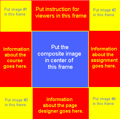
- Create a frame page following these steps:
- Choose images (face) of four subjects (you may choose to use the digital camera with your friends as subjects -- make sure they are the same size)
- Use Paint Shop Pro to divide each image into two images and save the halved images.
- create an HTML document-- that should have a frameset similar to this image.
- Each one of the surrounding corner frames should display the undivided image of a subject (four corners for your four subjects). The other surrounding frames should be designed per specifications given in the image that you just checked. The middle frame should display a combined image as follows:
Every time that you will click on the face (right or left) of a subject in one of the corner frames the left or right portion of that image should be displayed in the middle frame. This will allow you to combine several concepts that you have learned in this class (including frames and maps).
- When the page is initially loaded, the two pieces of the face of one of the subjects should be displayed in the center sub-frames. As you click on left or right portion of the face of a subject in one of the corner frames, that portion should be displayed in its appropriate location in the middle frame.
- Bonus points will be given if the composite images are seamless (to a reasonable degree)
.
- Create buttons, arrows, and other icons including one GIF animation to use in your class pages. Indicate where you used them in your FL_assignment_3.html document.
- Create a tutorial for a subject in the course you are designing. If you can not think of any, use a topic in Operations Research or Simulation.
- Use Ejay software to create a mix of about 30 to 60 seconds. Export it as a wave sound. You do not need to place the music on the Web page, but make sure that it is submitted in your folder.
- This assignment is due Friday February 20th at 5:00pm.